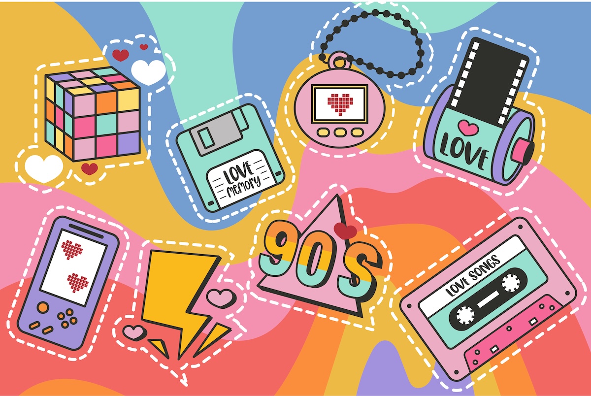
É fácil rir da web dos anos 90 agora – os GIFs piscantes, os banners da Comic Sans, os layouts de mesa presos com fita adesiva e esperança. Mas por baixo de todo esse caos havia algo que perdemos silenciosamente: personalidade.
A web naquela época era esquisitoe estranho foi maravilhoso. Era um lugar para expressão crua, criatividade confusa e genialidade acidental. Hoje, nossos sites são elegantes, consistentes e estéreis — otimizados até a morte. Então, por que tantos designers sentem falta secretamente da feiúra?
Vamos fazer uma viagem de volta ao tempo em que os pixels tinham charme, o skeuomorfismo dominava e cada página inicial parecia um diário.
Quando a Web era um playground
A web dos anos 90 não foi projetada. Era descoberto. Ninguém conhecia as regras porque não havia nenhuma. Cada site foi uma experiência – um reflexo da pessoa por trás dele. Você tropeçava na página Geocities de alguém e encontrava um fundo preto, texto neon e um GIF de bebê dançando, e não parecia errado. Parecia vivo.
Esses sites tinham alma porque eram pessoais. Você poderia dizer quem os fez. Os sistemas de design, estruturas e guias de estilo atuais fazem com que tudo pareça ter vindo da mesma agência de design. A web dos anos 90? Foi um caos – do tipo que dá origem à inovação.
Não havia equipe de UX, funil de conversão, apresentação de marca. Apenas pessoas se divertindo. Nesse sentido, estava mais próximo da arte do que do design.
Skeuomorfismo: a primeira ilusão fácil de usar
Antes que o design plano achatasse tudo, o skeuomorfismo era nosso tradutor visual. Botões pareciam botões. Não porque fossem vetores perfeitos, mas porque imitavam coisas reais. Uma lata de lixo parecia uma lata de lixo. Um aplicativo de bloco de notas parecia papel. Foi literal, quase ingênuo – mas funcionou.
Nos anos 90 e início dos anos 2000, o skeuomorfismo fez com que as interfaces parecessem humanas. Quando a Apple lançou o iMac original, ele tinha um plástico translúcido que você queria tocar. Quando os primeiros sites usavam planos de fundo texturizados, sombras projetadas e botões 3D, eles não estavam apenas se exibindo – eles estavam construindo confiança por meio da familiaridade.
Agora chamamos isso de “retro”, mas o skeuomorfismo não era um artifício; foi empatia. Dizia: você já sabe como isso funciona.Você não precisava de integração ou dicas de ferramentas. Apenas instintos.
Quando tudo ficou “plano”, perdemos aquele feedback tátil. O design plano foi uma rebelião – uma forma de eliminar o excesso e modernizar a web. Mas, como todas as rebeliões, foi longe demais. O que começou como clareza minimalista transformou-se em minimalismo emocional. Tudo parece igual: limpo demais para se preocupar.
Layouts de tabela: o sistema de grade original
Lembrar
layouts? The hack that launched a thousand design careers. Before CSS flex and grid, designers bent tables into submission to control layouts. It was brutal, inefficient, and… kind of brilliant.
Those tables forced you to think structurally. You had to understand hierarchy, spacing, and composition manually. Want a two-column layout with a sidebar? You’d nest tables inside tables like Russian dolls until it worked. The result? Fragile code, but surprisingly coherent design.
Today, CSS Grid can do that with a single line, but something’s missing: the intimacy of craft. When you built a 90s site, you felt the layout in your bones. You fought for every pixel.
There’s a satisfaction in that kind of problem-solving — the same kind artists feel mixing paint or tuning instruments. Table layouts weren’t elegant, but they made you earn your design.
The Return of Personality
Here’s the twist: we’re seeing the 90s aesthetic come back — on purpose. Not ironically, but proudly. Designers are rediscovering the joy of imperfections: pixel fonts, gradients that look like sunsets, oversized drop shadows, and brutalist grids that defy order.
Why? Because users are bored. The modern web feels homogenized. You can land on ten different startup homepages and barely tell them apart. Hero headline, minimal nav, centered CTA, rounded button, sans-serif typography. Rinse and repeat.
So indie creators and experimental brands are breaking the grid again — literally. They’re embracing retro aesthetics as a protest against blandness. The web used to feel alive; now it feels like a brochure. Pixel nostalgia is rebellion disguised as nostalgia.
Brutalism, Neobrutalism, and the Anti-Design Movement
We’ve seen waves of “anti-design” movements — brutalism, neobrutalism, post-minimalism — each echoing the same 90s impulse: design shouldn’t be invisible. It should provoke.
Brutalism on the web borrows from its architectural namesake — honest, raw, functional. It rejects polish. Neobrutalism adds color and irony to the mix. Think sites that look “broken” on purpose: misaligned text, unstyled forms, default system fonts. It’s ugly-beautiful.
This isn’t just aesthetic rebellion; it’s philosophical. The web used to be a place for expression. Now it’s optimized for conversion. The anti-design wave is a reminder that delight doesn’t always come from perfection. Sometimes, it’s the rough edges that make something feel human.
When Every Website Was a Performance
Back then, visiting a website felt like entering someone’s world. You’d click into a band’s homepage and find animated logos, MIDI background music, maybe a Flash intro if they were fancy. It wasn’t UX — it was theater.
Sure, Flash eventually became a bloated mess that tanked browsers, but it also gave birth to a generation of creative developers. It was our playground for animation, storytelling, and interactivity long before WebGL or Lottie files.
People performed on the web. They made art with code, not just commerce. Today, we optimize load times and funnel conversions. Back then, we just wanted to wow people. And somehow, even with all the chaos, we did.
The Authenticity We Lost
What we’re really nostalgic for isn’t GIFs or gradients. It’s authenticity. The early web wasn’t perfect, but it was real. Every pixel was hand-placed. Every “Under Construction” GIF meant someone was still tinkering, still learning, still building their corner of the internet.
Now we design for scale — not for souls. CMS templates, design tokens, and AI generators make creation faster but also flatter. It’s efficient, yes. But it’s also alienating. You can’t tell where one designer’s voice ends and another’s begins.
The 90s web wasn’t better — but it was more honest. It reflected the messiness of human creativity, not the polish of corporate branding. Maybe that’s what we miss most: the sense that someone was behind the screen, not something.
The New Retro-Futurism
Ironically, our modern tools are letting us re-create that 90s chaos — intentionally this time. Designers are combining nostalgia with sophistication: pixel art meets smooth animation; hand-coded vibes meet CSS precision.
This “retro-futurism” blends the best of both worlds. Think: gradients with purpose, skeuomorphic touches that guide users instead of overwhelming them, and chunky typography that feels friendly, not kitschy.
It’s not about going back. It’s about remembering why the old web worked emotionally — and bringing that human warmth forward into the AI era.
Why It Matters Now
In a world where algorithms personalize everything and AI can spin up a site in seconds, designers are rediscovering something profound: personality is the only thing machines can’t fake well.
The 90s web reminds us that authenticity beats optimization. That imperfection builds trust. That a handmade interface — even an ugly one — can feel more alive than a perfect template.
We’re entering an age of generative design, where the web itself designs itself. Maybe that’s why we’re drawn back to the handmade aesthetic — it’s our last defense against automation. Pixel nostalgia isn’t just about aesthetics; it’s about identity.
The Future Is Imperfect
As we rush toward AI-driven everything, the 90s web stands as a reminder: perfection is overrated. The web was born out of curiosity, not conformity. It was supposed to be personal, experimental, and a little bit strange.
The next wave of design won’t come from cleaner grids or smarter algorithms — it’ll come from rediscovering the joy of breaking them.
So bring back the gradients. Bring back the hover sounds. Bring back the pixel fonts that make no sense but make you smile.
The 90s web wasn’t pretty, but it was alive. And maybe that’s exactly what our perfectly optimized world needs again.
Louise is a staff writer for WebDesignerDepot. She lives in Colorado, is a mom to two dogs, and when she’s not writing she likes hiking and volunteering.
Existem tantas ferramentas novas – e boas – para designers por aí agora. De pequenos pedaços de inteligência artificial a ícones que encantam, há algo para ajudar…
 1")
 2")
 3")
 4")
 5")
 6")